
INTERACTIVE HOME DESIGN TOOLS
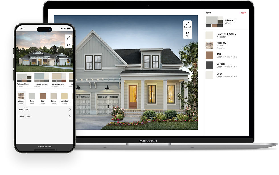
Redesigned Anewgo's core functionality home design tools to have a consistent look and feel that was optimized for learnability and mobile screens. These tools were integrated across the entire Anewgo suite of products.
ROLE
I joined the team as Anewgo's first in-house UI/UX Designer. I was in a team of two developers, one QA, and one PM.
CHALLENGE
These tools were originally meant to be used independently but were stitched together into a confusing home design journey
Because of this, layout and styling were inconsistent. Over the years, the company have stitched it together into a design journey in the My Home App, leading to an inconsistent UI and confusing user flow with poor optimization for smaller viewports.
APPROACH & IMPACT
Optimized for learnability and responsiveness across all devices
Redesigned to have a consistent look and feel that prioritized learnability and responsiveness across all devices. We shifted from the original top-down design to a screen-by-screen approach that contributed to sequential learning. Each tool now has its own dedicated screen, replacing the previous setup where all tools were confined to a single page. In doing this, the design journey was broken down to manageable steps.


CONCEPT EXPLORATION
Looked at adjacent industries with product customization
While Anewgo's tools function independently, they also need to integrate seamlessly into a cohesive design journey. I explored adjacent industries like car sales and customization, where I identified strong parallels between the home buying and car buying journeys.
I observed common design principles, such as:

CONSISTENT LAYOUT
First and foremost, the customization journey needs to feel like a journey. By having a consistent UI, where each step focuses on a different aspect of the house, users can feel in control of their homebuying journey due to the ease of learnability.

MINIMALIST DESIGN
Reducing the cognitive visual load is essential in a process where there are a lot of options to consider so users can process information more easily.

SEQUENTIAL LEARNING
A guided experience is beneficial for potential buyers who are unfamiliar with home customization. The current top-down UI has a lot of visual clutter, which can overwhelm users and lead to decision paralysis.
BACKGROUND
What are the Anewgo home customization tools?
These are standalone design tools that allow users to customize their selected homes. They are part of Anewgo's broader ecosystem, which is designed to enhance the homebuying process by engaging customers with interactive design experiences.
Each tool allows potential buyers to customize different aspects of their home.
-
Exterior - outside facades, materials, colors
-
Floor Plan - rooms, layouts, plan options
-
Interior - room designs, colors, materials
-
Site Plan - lot details and community layout
.png)
DESIGN
STARTING WITH THE LAYOUT
Consistent layout and styling across all four design tools are key in promoting learnability
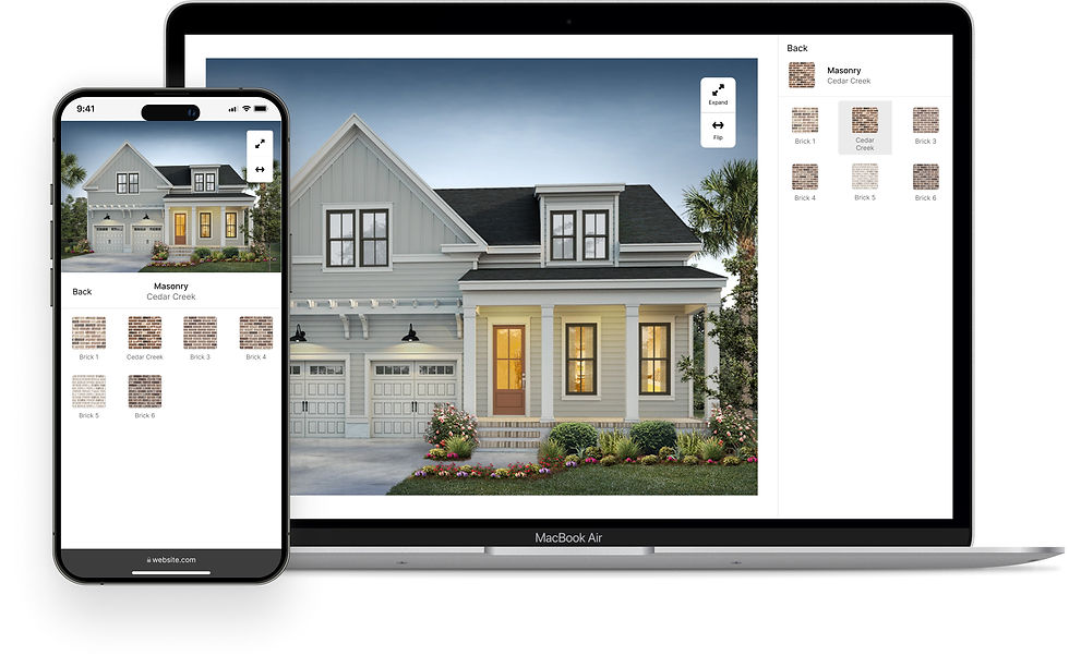
To create a cohesive experience, I divided all design tools into three basic parts: content, panel actions, and sub-actions. Regardless of the function of the design tool, this layout was reflected across all breakpoints. I also kept a very minimalistic styling across the elements.
When the design tools are embedded into a builder website's page, the design tools can instead be opened in a new modal to avoid unintended scrolling.

After learning about the current implementations and pain points, I determined that the main goals would be to:
-
Create a visually cohesive layout for each design tool that will improve overall user experience
-
Optimize designs for mobile

Users integrating the exterior tool via an iFrame into their websites frequently report issues with the layout, particularly due to a confusing option hierarchy. This complexity, paired with very poor adaptability to smaller screens renders the tool difficult to use and navigate.
.jpg)

DESIGN TOOL #1
Exterior - outside facades, materials, and colors
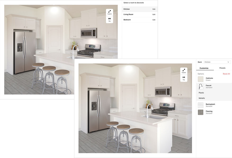
The interior design tool shared similar problems with the exterior design tool. So I used this opportunity to have both the exteriors and interiors to share the same layout, behavior, and functionality when selecting options.
.jpg)
%20(1)%201.png)

DESIGN TOOL #2
Interior - room designs, colors, and materials
The most prominent UX problem in the floor plan was not being able to see the floor plan changes as a user selects an option. But this change would be more technically complex so the initial changes relate more to the layout and other functional enhancements.
In mobile, this problem is more apparent as you can only either see just the floor plan or just the list. Thus, when you select an option, it's hard to determine what changed in the floor plan


DESIGN TOOL #3
Floor Plan - room layouts and plan options
The site plan tool had the most user experience problems and iterations. Unlike the three other design tools, the site plan is a potential starting point for a user where they select a lot, plan, then an elevation/style to start designing. But users have reported that this order is not immediately obvious to them due to the lack of instructions and context on what some sections mean.
In mobile, the starting point is a list of all the lots instead of the map. From previous research, users have stated that even on mobile, they would prefer to see a map first since that is what they’re expecting. A list with a small thumbnail does not provide enough information to compare that lot against other lots or the map as a whole.

.jpg)

DESIGN TOOL #4
Site Plan - lot details and community layout

How are these tools utilized today?
These tools are currently implemented either independently in various builder websites or as a design flow in physical community sales centers in large TV formats.
When embedded in a website, each tool sticks out like sore thumb due to the drastically different UI between the tool and the site. In the sales center and other marketing apps, the tools are used as a design flow. But due to the different layouts and buttons of each design tool, this leads to a confusing design experience.
UX AUDIT
Identified areas for improvement and pain points for each design tool both as a singular tool and as a design flow
I conducted a comprehensive NN UX audit, rigorously testing the old designs against NN's usability severity scale. After gathering key insights from this analysis, I compared the insights against user complaints that had been raised by consumers. This comparative analysis then informed the primary objectives of the redesign.
CONCLUSION
IMPACT
An on-brand, minimalistic, and visually approachable dashboard
The home design tools were specifically created to function both as a design flow and as standalone tools. This led to the development of two new Anewgo products: the Home Designer and the Configurator.
-
The Home Designer organizes the tools as a design flow, which addresses the needs of mid-large tier builders who utilize the entirety of the tools, starting from the exterior up until the summary of their selections.
-
The Configurator is the standalone tool for builders who only need a singular tool based on their needs.
Thus, all builders who used the old design tools have been retired and all builders have either been transitioned to the Home designer or Configurator with the new 3.0 design tools.
The design tools, are also easily integrable with other Anewgo products, and were intentionally designed to accommodate for additional CTAs and buttons within the layout. For example, it’s used in both the new Sales Center App for people who enter physical sales centers and the Anewgo Website Platform for builders who have subscribed to our website services. This ensures consistency for potential homebuyers regardless where they first encounter the home design tools.


NEXT STEPS
Refine tools with user feedback and scenario testing
-
Continually gather user feedback on areas users may still experience confusion or drop-off
-
Evaluate the effectiveness of micro-interactions and visual cues through testing specific scenarios and edge cases
-
Evaluate usability by measuring conversion rates (number of people who have successfully saved a brochure/summary)
-
Continue tailoring the Anewgo home design tools to the specific needs of upcoming Anewgo products, while preserving a consistent layout and functionality across all tools.


KEY TAKEAWAYS
Standardization and drawing inspiration from adjacent industries
-
Standardize first and customize later. Despite the product's wide impact across all Anewgo tools, focusing on a standardized layout and core design goals saved us from going in circles before adding tailored features.
-
Look to the market fit and insights from adjacent industries. Starting with no market research, except feedback of the UI being messy and confusing to use, I immediately looked at adjacent industries big on design personalization such as cars. By mirroring this step-by-step flow, we leverage people’s existing familiarity to create a more intuitive experience.


.jpg)
.jpg)
.jpg)
.jpg)
.jpg)
.jpg)

.jpg)

.jpg)

.jpg)
.jpg)
.jpg)
.jpg)
.jpg)