If users have access to an online platform that is conducive for peer-to-peer learning and allows students to engage with a like-minded student community whenever and wherever they want, then this can significantly improve learner motivation and performance.
Allowing them to connect with others in their field to discuss topics, receive feedback on assignments, and even find others willing to collaborate on projects. A platform that balances that communication in a social app, the networking in a career app, and the resources in an educational app.
Hypothesis
How can I stay motivated and get ahead in my online program while making sure I still have time for my other responsibilities?
Problem
%201.png)
Since the Covid-19 pandemic and the shift to remote working, people have looked into online learning to develop their skills. In Coursera's 2021 Impact Report, new registrations have almost quadrupled from 21M in 2016 to 92M in 2021.
As people need to balance work, family, and other responsibilities, the flexibility that online learning offers is unrivaled. Despite this, remote leaning requires a great amount of self-discipline and this can be difficult in a solitary environment without peers for support.
Context

StudyHub
StudyHub is a responsive web app that allows students to connect with a student community in the same program or field to discuss topics, share resources, receive feedback, and increase motivation.
Timeline
1 Month
Role
UX/UI Design, Information Architecture
Tools Used
Draw.io
Balsamiq
Figma
Goal
To help students connect with a like-minded student community wherever and whenever, while juggling school, work, family, and other responsibilities
Discovery
I consolidated all the insights into a persona. Meet Alex! Alex is a student enrolled in an online course who works part-time as a retail store manager. Connecting with other students immediately brought my mind to social media/networking apps. But, connecting online is one thing. How do I elevate the learning experience further after establishing these connections, especially for someone with a situation like Alex?

Persona
Key Features for Designs
Profile Creation
Users create a profile to establish searchability and help them find the right community
Search Functionality
Users are able to search for students or groups that are taking the same/similar program as them.
Main Feed/Activity Feed
The central hub for users to interact and collaborate with their community
Messaging & Notifications
Users can stay up-to-date with relevant posts, resources, and messages
I used Balsamiq to build low fidelity wireframes of the high level navigation features in the mobile breakpoints first so I knew the minimum content needed for each screen. I had so many ideas on how to elevate the app and not just make it another social media platform but I built the main pages first. Once I had all the base features of onboarding, search, feed, and notifications/messaging laid out, I moved to designing in mid-fidelity to create the pages in between.

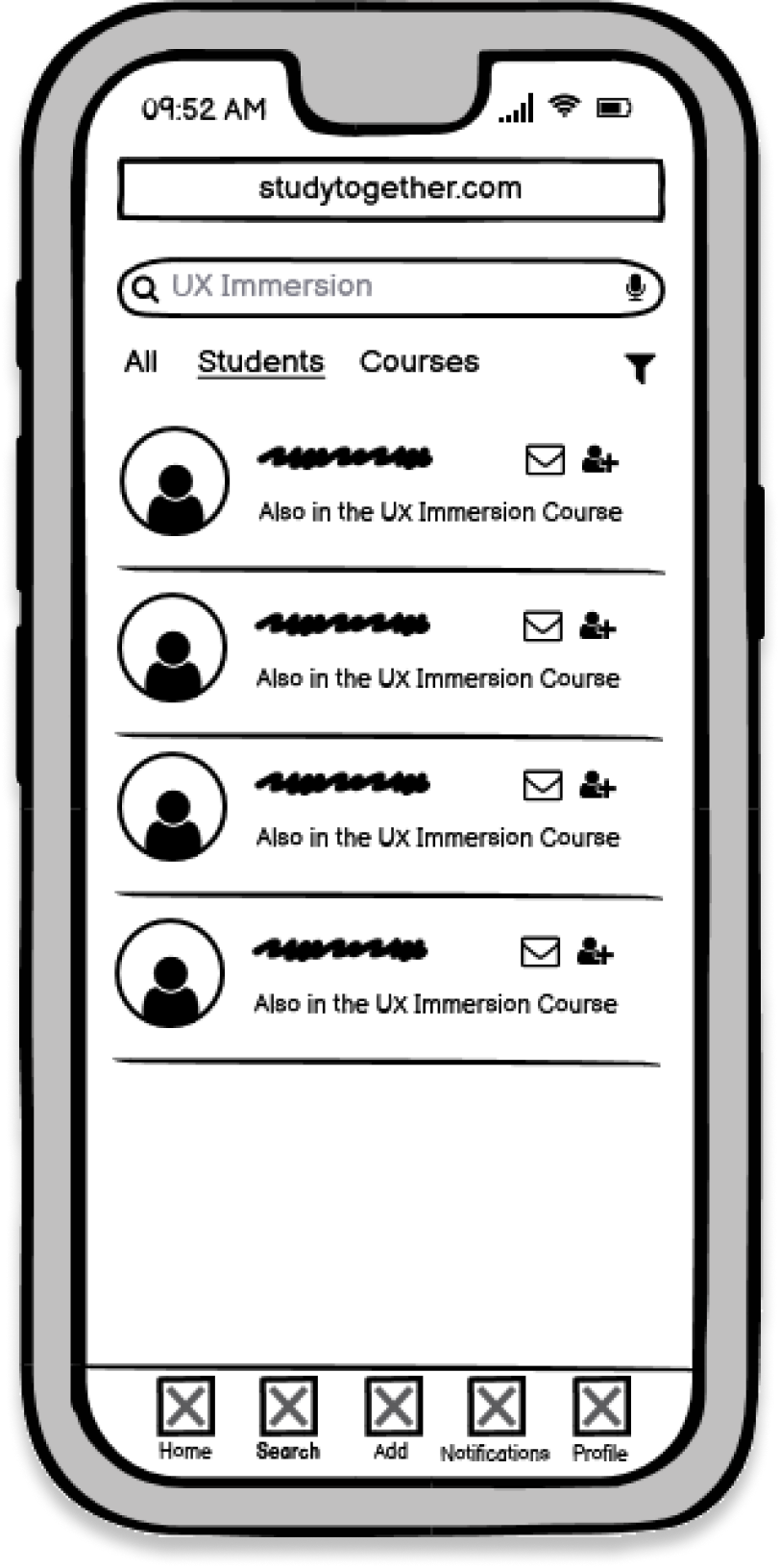
%201.png)

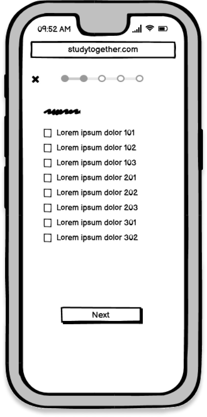

Low Fidelity Wireframes
I then started playing around how the tablet and desktop breakpoints would look like. Rather than just fill out the whitespace, I used columns to bring the sub-features like "Saved Files" into view. I always asked myself "how can I make Alex's experience as quick and productive as possible so I started adding features like the "Quick Help" function, calendar, and study sessions. As this was a web app, I also generated a landing page that encapsulated the features and ecosystem within the app.
Mid-Fidelity Wireframes
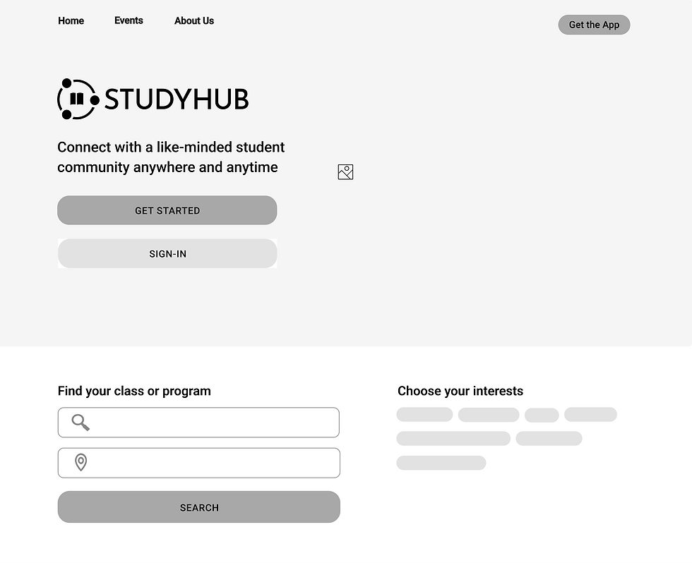
%201.png)


%201.png)
%201.png)
Design
With a brand identity solidified, I wanted to make sure the design style was set. The highly legible font and the contrast of the orange on the white guides the users' eyes to the main path of each user flow. These patterns can be seen prominently in the messaging feature and profile pages, where initiating connection is key.
Style Guide
Intro and Profile
Creation
Key features
-
From the landing page, users are already able to search for a community to connect with.
-
Setting-up a profile not only creates a customized experience but also allows a targeted search by peers.

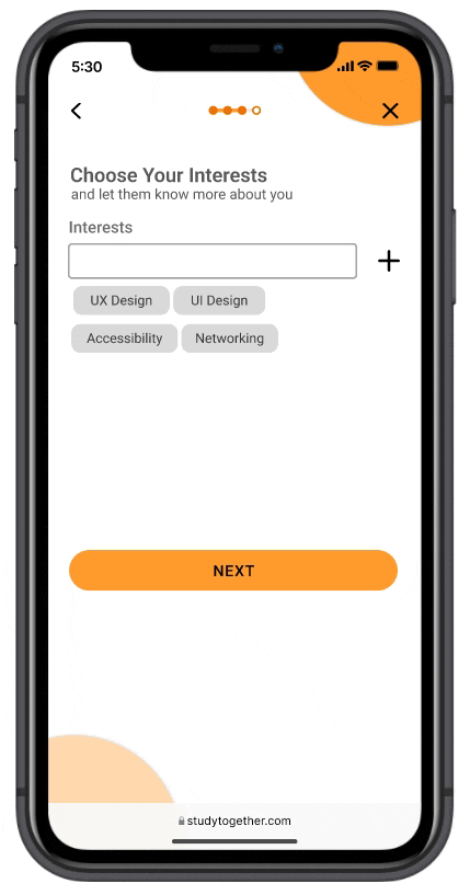
Landing page
Profile completed
Student Feed
Key features
-
The central hub for interacting with the user's network
-
Find relevant posts and organize study sessions
-
Quick Help - Post or receive feedback quickly from homework questions.

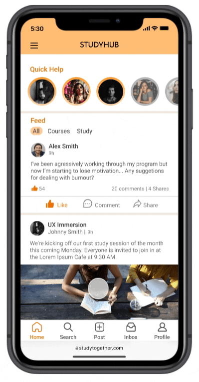
Feed: liking posts and Quick Help Feature
Post: Creating a study session
Search & Group
Features
Key features
-
Provides a recommendation of people and groups who are taking the same program or class as the user.
-
Groups are a community of students who are taking a similar program or field. Files, study sessions, posts, and images are all organized here.


Search function with filters
Group page with tab view
Notifications & Messaging
Key features
-
Users can stay up-to-date with upcoming study sessions, new study materials, and relevant posts.
-
Messaging feature is also available where users can easily chat, exchange files, or set-up a study sessions.
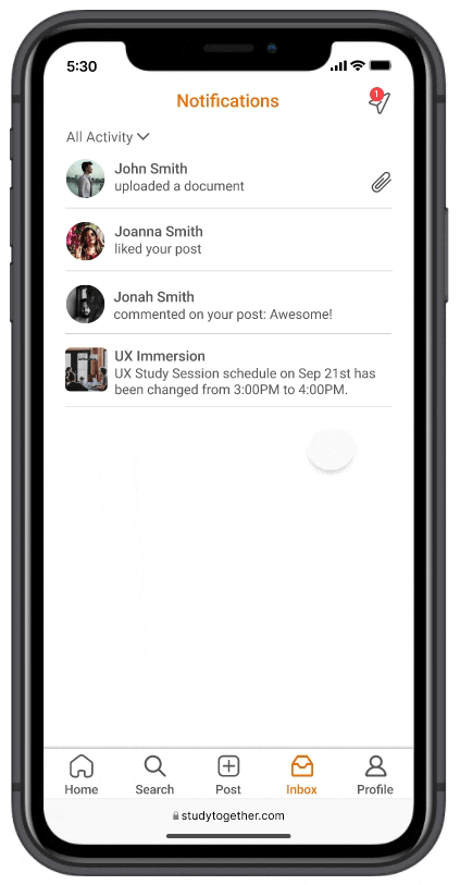

Different health aspects
Bookmarking a resource
Conclusion
-
Usability testing is essential in validating the design decisions we have made up tp this point. User stories and personas may shed some light on the task flows but it cannot fully encapsulate the variation and variability in human decisions and interactions.
-
Integrating a mentor/mentee functionality within the app furthers the mission of collaboration. This exchange of insight and experience is vital knowledge for a student just dipping their toes in a certain field.
Future Considerations


Be intentional when designing for breakpoints.
Designing for the tablet and desktop versions do not mean fill up the whitespace with additional features.
Good UI makes good UX sense
A visually-appealing and engaging UI design pattern is just as applicable in making users feel comfortable when using the product.
Key Takeaways
.png)
.png)

Who?
Students who’d like to connect with fellow students in their field or discipline
What?
Responsive web app that allows students to connect and discuss their studies on any device.
When?
Between classes, work, or anytime the user is available.
Where?
Users can stay connected anywhere, as long as they’re logged in on a device.
Why?
Enhance the learning experience of students by connecting them with peers.
Prior research has already been provided in identifying the key user needs for the app. The 5 Ws were given to encapsulate the intended app's purpose and functionality. It was my goal to materialize this vision and communicate its purpose of connecting students online to facilitate peer-to-peer learning and support through the architecture and design. High-fidelity mockups, as well as an organized design system were the expected design deliverables to be accomplished.
Scope
Six user stories were generated based on prior research to give context to Alex's goals. Six user stories does not mean six high-level navigational features. I mapped each journey to corresponding main and sub user tasks. I then found the commonality between all these tasks and consolidated them into four key features that will be the focus of my initial designs.
User Story Mapping

Ideation

Two mood boards were created to convey the possible visual direction the app can go towards. I did a preference test and asked users which mood board most closely related to the word "Collaboration". Across 50 participants, 87% reported mood board #2 to be more closely related to the word "Collaboration". The first had a more welcoming and relaxed mood while the second conveyed a more motivational tone. I had to find the right balance of not making it as serious as a professional networking app but also not as casual as a social media app.


Mood Board


